May 1, 2024
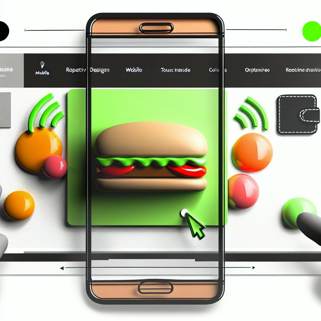
With more people using mobile devices to access the internet, having a mobile-friendly website is crucial for restaurants to attract and retain customers. Here are the key points to optimize your restaurant's website for mobile users:
Benefits of Mobile Optimization
Responsive Design
Responsive design ensures your website adapts to different devices, providing a seamless experience across desktops, tablets, and smartphones.
User-Friendly Mobile Experience
Mobile Ordering and Payment
Integrate secure mobile payment options like QR codes, mobile wallets, and digital payment apps to provide a convenient and efficient payment experience.
Visuals and Design
By following these strategies, you can create a mobile-friendly website that drives business growth and customer satisfaction.
Mobile optimization is crucial for restaurants to engage with customers effectively. With more people using mobile devices to access the internet, it's essential to ensure your website looks and functions well on any device. 43% of restaurants receive online orders directly through their websites, making mobile optimization vital for driving more traffic and conversions.
Restaurants are the most searched industry by consumers through both mobile applications and browsers. A mobile-friendly website can attract and sustain more customers, driving more traffic and conversions to your restaurant website.
Mobile visitors have different needs than desktop visitors. They need quick information about your menu, hours of operation, or location while on-the-go. A mobile-friendly website should be:
By prioritizing mobile optimization, you can stay ahead of the competition and provide a better user experience for your customers.
Responsive design is a way to build websites that work well on different devices, such as desktops, laptops, tablets, and smartphones. This means that a website with responsive design will adjust its layout, content, and visuals to fit the device it's being viewed on.
Responsive design is important because it helps restaurants provide a good user experience across different devices. With more people using mobile devices to access the internet, a responsive website can help restaurants attract and keep customers by making it easy for them to find essential information like menus, hours of operation, and location.
Here are some benefits of responsive design:
By using responsive design, restaurants can provide a better user experience, drive more conversions, and improve their online presence.
Creating a user-friendly mobile experience is vital for restaurants to attract and retain customers. A well-designed mobile website can make a significant difference in how users interact with your restaurant online.
A simple navigation design is essential for a mobile website. With limited screen space, it's crucial to minimize bounce rates and maximize user engagement. Here are some tips to simplify navigation:
By simplifying navigation, you can reduce friction and make it easier for users to find what they need, resulting in a better user experience.
Mobile users often have a specific goal in mind when visiting a restaurant website, such as finding the menu, making a reservation, or placing an order. To cater to these needs, prioritize key information on your mobile website by:
Key InformationTipsContact detailsDisplay phone numbers, email addresses, and physical addresses prominently.Hours of operationShow opening and closing hours, including special hours for holidays or events.Online orderingProvide a clear call-to-action (CTA) for online ordering, including links to third-party ordering platforms.MenuOffer a concise menu or a link to a more detailed menu page.
By prioritizing key information, you can improve the user experience and increase conversions on your mobile website.
Remember, a user-friendly mobile experience is critical for restaurants to attract and retain customers. By simplifying navigation and prioritizing key information, you can create a mobile website that meets the needs of your users and drives business results.
Optimizing the mobile menu is crucial for restaurants to provide a seamless user experience on mobile devices. A well-designed mobile menu can make a significant difference in how users interact with your restaurant online.
A clear and fast menu design is essential for mobile users. With limited screen space, it's crucial to minimize clutter and ensure that the menu loads quickly. Here are some tips to achieve a clear and fast menu design:
Design TipsDescriptionUse a vertical menu layoutReduces image scaling and the need for users to pan and zoom.Minimize optionsOnly include priority tasks and essential pages to avoid overwhelming users.Make navigation easily accessibleConsider sticky navigation on top of the design to give users all-time access.Include searchMake search a part of the menu to provide users with quick access to your catalog.Use readable fontsChoose highly readable fonts with enough space between letters and options to make it easy for users to tap on the chosen label.
By following these guidelines, you can create a mobile menu that is both clear and fast, providing users with a seamless experience.
Keeping the menu up-to-date is vital to maintain customer trust and satisfaction. Outdated menus can lead to confusion and frustration, resulting in a negative user experience. Here are some tips to keep your menu up-to-date:
1. Regularly update menu items and prices: Ensure that your online menu reflects the latest offerings and prices.
2. Use a content management system (CMS): A CMS can help you easily update menu items and prices without requiring technical expertise.
3. Train staff to update the menu: Ensure that staff members are trained to update the menu regularly to maintain consistency and accuracy.
By keeping your menu up-to-date, you can provide users with an accurate and reliable experience, increasing customer satisfaction and loyalty.
Integrating mobile ordering and payment solutions into your restaurant's website can greatly improve the customer experience, increase efficiency, and boost revenue. In this section, we'll explore ways to implement a mobile-friendly, secure, and efficient online ordering and payment system.
Providing a variety of mobile payment options is crucial for a seamless customer experience. Here are some benefits of integrating mobile payment options:
Here are some popular mobile payment options for restaurants:
Mobile Payment OptionDescriptionQR Code PaymentsCustomers scan a QR code to pay their bills, eliminating the need for physical payment terminals.Mobile WalletsCustomers can store their payment information in mobile wallets like Apple Pay, Google Pay, or Samsung Pay, making transactions quick and secure.Digital Payment AppsRestaurants can partner with digital payment apps like PayPal, Venmo, or Square to provide customers with a seamless payment experience.
By integrating mobile payment options, you can provide customers with a convenient, secure, and efficient way to pay, enhancing their overall dining experience and increasing loyalty to your restaurant.
Optimizing your restaurant's website for mobile users requires careful consideration of visuals, including images and design. High-quality, fast-loading images are essential for creating a visually appealing and user-friendly experience on mobile devices.
When it comes to mobile devices, image optimization is crucial to ensure fast loading times and a seamless user experience. Here are some tips to optimize your images and media for mobile:
Optimization TipDescriptionUse responsive imagesEnsure images adapt to different screen sizes and resolutions.Compress imagesReduce image file size to improve loading times.Use lazy loadingLoad images only when they come into view to reduce initial load time.Optimize video contentUse formats like H.264 and WebM, and consider lazy loading for videos.
By optimizing your images and media, you can improve the overall user experience of your restaurant's website on mobile devices, leading to increased engagement and conversions.
Remember, a visually appealing and user-friendly website is essential for attracting and retaining customers in the competitive restaurant industry. By prioritizing mobile optimization, you can stay ahead of the competition and provide a seamless experience for your customers.
To ensure your restaurant's website provides a great mobile experience, it's essential to test and improve its usability regularly. With most customers accessing your website through mobile devices, a seamless mobile experience is crucial for attracting and retaining customers.
To identify areas for improvement, use web analytics tools to understand user behavior and make data-driven decisions. Google Analytics is a great tool for tracking website metrics, such as page loading times, bounce rates, and conversion rates. By analyzing these metrics, you can pinpoint issues and optimize your website accordingly.
For example, if your analytics reveal a high bounce rate on your mobile menu page, you may need to simplify your menu design or improve page loading times. By leveraging analytics, you can refine your mobile user experience and increase conversions.
Additionally, use Google's Mobile-Friendly Test to assess your website's mobile usability. This tool provides a comprehensive report highlighting mobile usability issues, such as font sizes, tap targets, and page loading times. By addressing these issues, you can ensure a seamless mobile experience for your customers.
Mobile Usability Issues to Address
IssueDescriptionFont sizesEnsure font sizes are readable on mobile devices.Tap targetsMake sure tap targets are large enough for users to click easily.Page loading timesOptimize page loading times to reduce bounce rates.
Remember, testing and improving your mobile site is an ongoing process. Continuously monitor your website's performance, gather customer feedback, and make data-driven decisions to refine your mobile user experience. By doing so, you can stay ahead of the competition and provide an exceptional mobile experience for your customers.
In today's digital world, having a mobile-friendly restaurant website is crucial. By following the strategies outlined in this guide, you can stay ahead of the competition and provide a great mobile experience for your customers. This is essential for attracting and retaining customers, increasing engagement, and driving conversions.
Here are the benefits of prioritizing mobile optimization:
BenefitsDescriptionEnhanced user experienceMake it easy for customers to find what they need on your website.Increased online orders and reservationsMake it easy for customers to order or reserve a table online.Boosted conversions and revenueIncrease sales and revenue by providing a seamless mobile experience.Staying ahead of the competitionStay ahead of your competitors by providing a great mobile experience.
By optimizing your restaurant's website for mobile users, you can create a website that drives business growth and customer satisfaction.
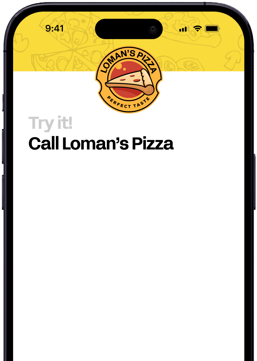
Enter your information in the form to receive a call from Loman and place an order like a customer would!
